Local Culture Creative Marketing Branding Case Study
May 24, 2024
|
6 minute read
Agency Update
Share
In a world saturated with brands, the only way to stand out is to present yourself as professionally and as cohesively as possible. This was the challenge we faced when redesigning the visual identity for Local Culture Creative. As a leader in social media marketing, LCC needed a visual identity that reflected our competency and instilled confidence in our clients.
Intentionality
It’s becoming ever-so simple to utilize tools like Canva, or the myriad of AI software that has cropped up in the last two years, to create a “logo.” But the main difference between a logo and a visual identity is intentionality. The options you will find on Canva or whatever an AI software will spit out are never truly original or intentional. Designers, with a trained eye in art direction, are what make the difference between something that looks good but is meaningless, and something that looks good, serves a purpose, and represents your brand accurately. Using this philosophy, we went to work on redesigning a brand that we knew needed to stand head and shoulders above the rest.
The Process
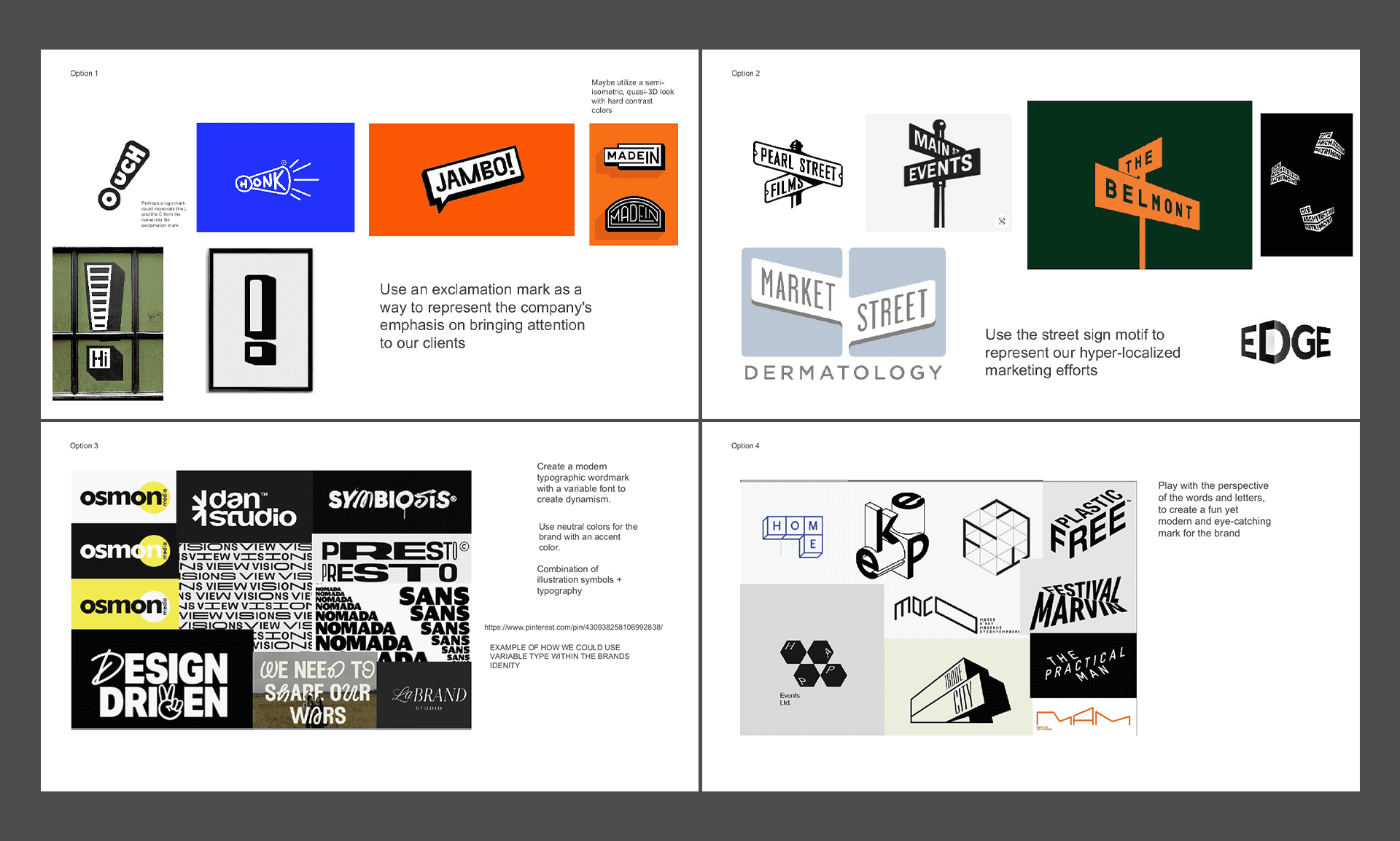
We started by identifying four directions that we wanted to explore. Each had a design direction that was attempting to address a specific intention for the brand. Zeroing in on the mission statements of our company, “through thoughtful and customized advertising and an integrated marketing approach, we help create a buzz around your business. It is our goal to provide unparalleled service, inspire creativity, and become a true business partner,” we got to work on directions that aimed to best represent the brand through visual design. We collected several references to create a mood board in order to visually represent the ideas we were aiming to explore. From the start, there was a strong interest in the direction that would incorporate an exclamation mark into the logo to represent the emphasis or “buzz” that LCC brings to our clients.
We then began to work on early sketches and initial rough designs. At this stage in the process, there are no bad ideas. All concepts and ideas are sketched and drafted. This is very much like a “mining” process, trying to find that diamond in the rough.
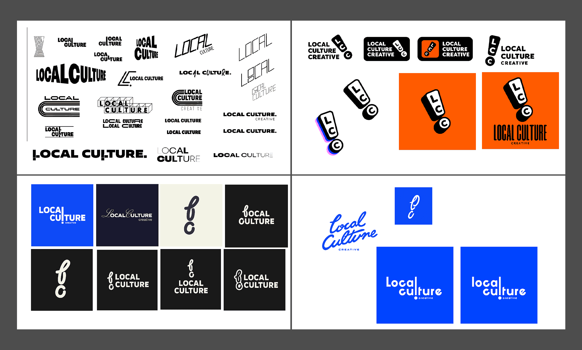
Once enough concepts have been laid out and ideas have been exhausted, the next phase involved narrowing things down to the concepts we most wanted to see fleshed out. Since this was an internal redesign, communication was constant with the senior team to keep them in the loop of the process and the decisions that were taking place.
Three concepts were chosen, out of the dozens of sketches and ideas, to be fleshed out and perfected. These were then presented to the senior team with an explanation behind our choices in direction.
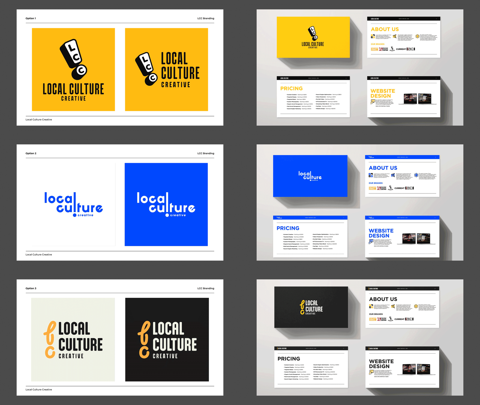
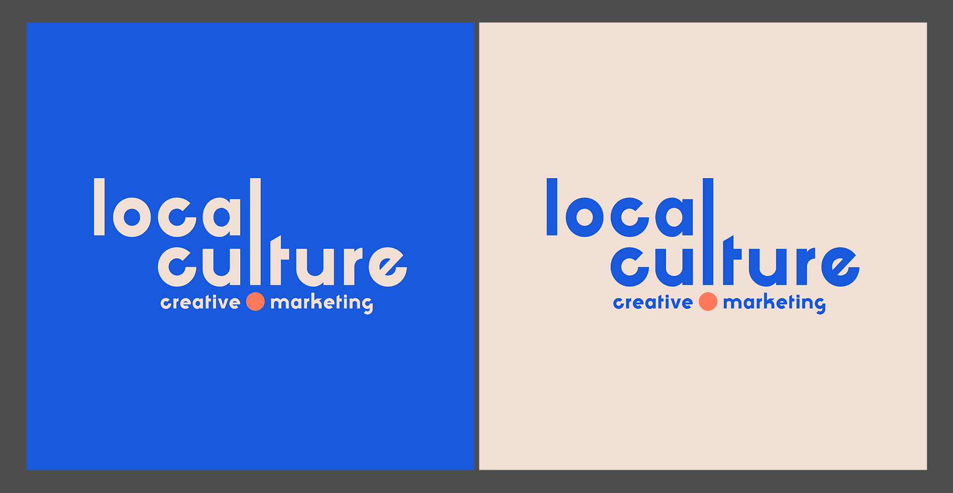
In the end, the current logo was chosen due to its sense of cleanness, the incorporation of the exclamation mark, and the tone of the typography. A colorway that matched LCC’s parent company Chava Communications was chosen to keep the relationship between the two companies close. From there, our job was only a third of the way done.
Tying it All Together
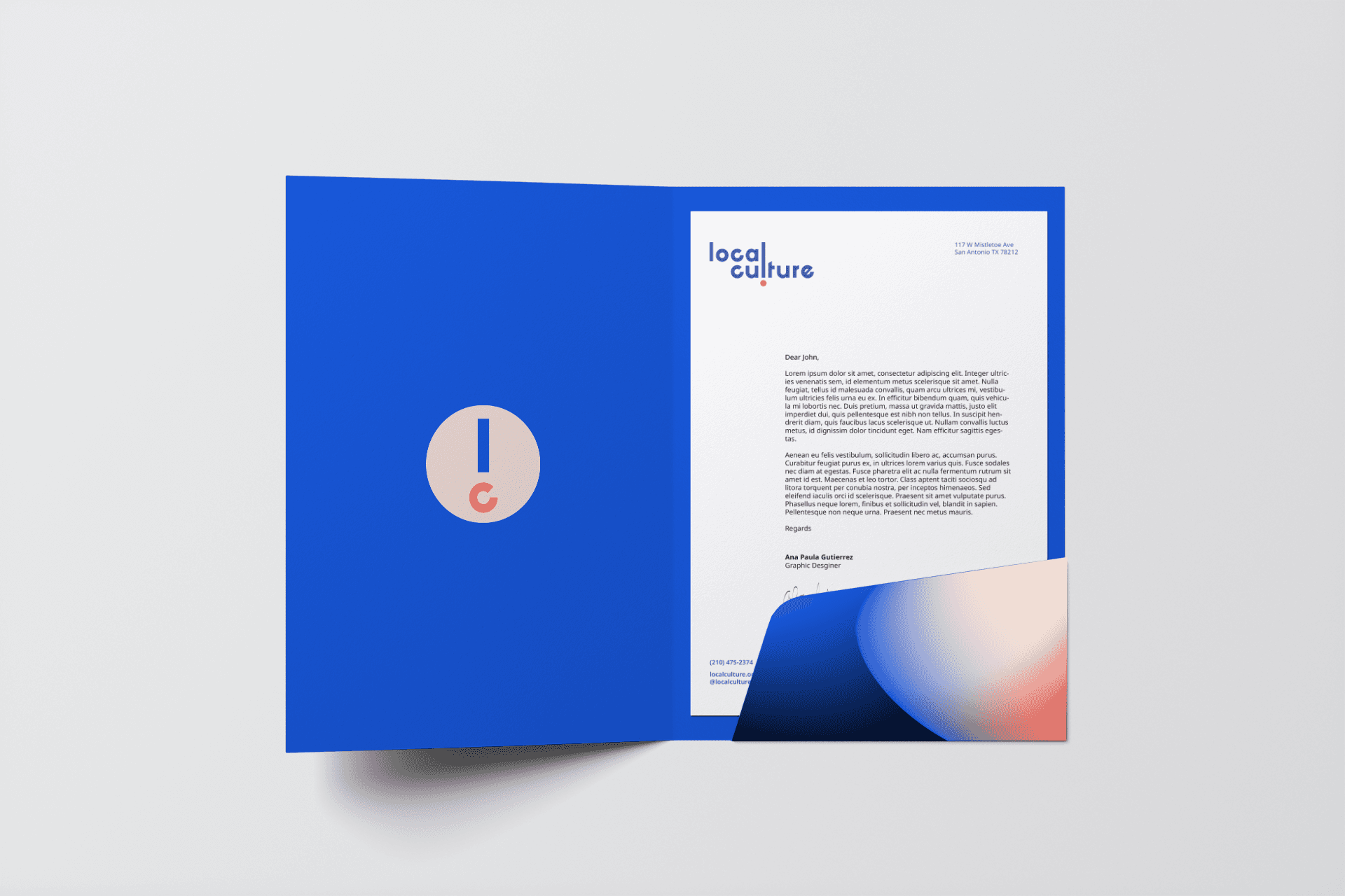
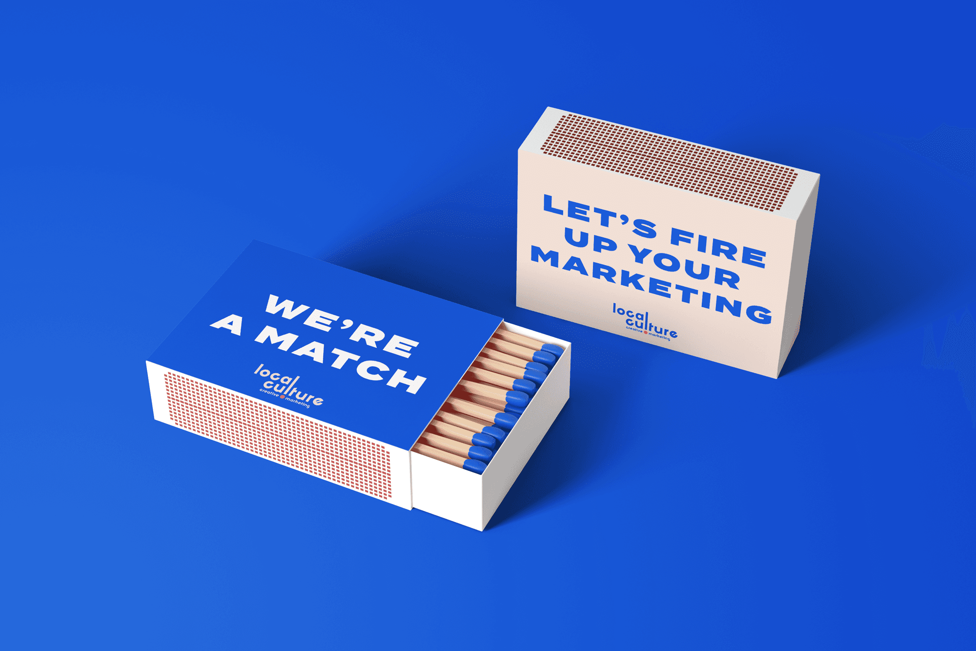
A logo is only a portion of a branding package. It is certainly the most important portion, but on its own, a logo does not create a visual identity. Once the final logo was chosen, we set out to create variations, as well as branding assets that could be utilized across every bit of communication, platform, and expression for our agency. Things as simple as backgrounds for our presentation decks, icons for our social media platforms, and assets that visually represent our services, were all created and collected to support the brand.

Conclusion?
In the end, our senior team was pleased with the results, and our visual identity can now stand to present itself to others as we offer the very type of services we utilized to create our brand identity. In fact, using the phrase “in the end” is a misnomer. A true visual identity is technically alive and always evolving. We have already been expanding our visual identity and will continue to do so as our agency grows. As we know, a brand identity is only as good as its intended goal. For us at Local Culture, we want our clients to know that they are in good hands from the moment they see our brand identity.
Written by
David G. Loyola

4 minute read
|
7 minute read
What’s New on Instagram in 2025
The pros at Local Culture Creative Marketing dig into the latest Instagram features and updates.
7 minute read
|
7 minute read
Why Grassroots Marketing and Event Activations Matter: A Local Culture Perspective
Grassroots marketing and event activations for businesses to build genuine community connections.